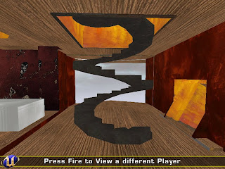
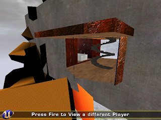
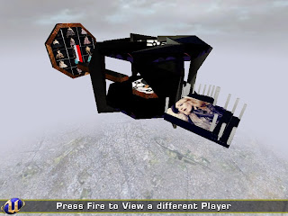
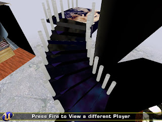
Week 2's model inspired by the folding technique talked about in one of the texts and also on an image by one of the architects given to us' works.
My model for week 3, I didnt have a chance to take it with me home that day because it would break, so I left it overnight at uni to bring my camera the day after - but then it looked like this. It was trashed.
The model was supposed to portrait the same experience as my collage below.
My collage for week 3, framing images of my experience in Hyde Park, where there was a bunch of chinese lamps and decorations put up that caught my interest.
torsdag 29 oktober 2009
måndag 28 september 2009
Final Submission period 2
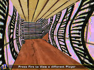
My tunnel representing a club
(For some reason everything blue to come is supposed to be red, but changed when uploaded)
Adding the same amount of colour from the smaller picture and applying it to the inside of Zaha Hadid's building.
Showing how red (looks like blue for some strange reason on here) goes from very dark till really light.
måndag 17 augusti 2009
söndag 21 juni 2009
Links for experiment 3
Final Submission:
http://files.filefront.com/13920504
Draft 1:
http://files.filefront.com/13920619
Draft 2:
http://files.filefront.com/13920568
http://files.filefront.com/13920504
Draft 1:
http://files.filefront.com/13920619
Draft 2:
http://files.filefront.com/13920568
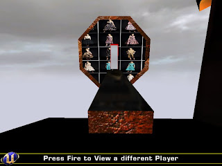
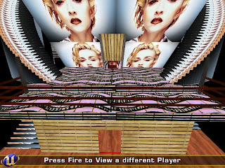
Developed Prada and Madonna Office's
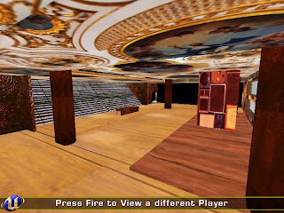
Pradas office.
Keeping her space with surfaces that are easily appearing and avoiding loud colouring in the sense of it being too "modern" or "crazy", I tried to keep the design as a reflectance of her way of designing. That being cool, comfortable and graceful with colouring that are quite basic.
Inside I added a catwalk for her to show her pieces to clients. A graceful stairway are placed in the entrance of the first floor, as well as a space for her to meet her clients, that takes you up to her studio where she does her drawings and thinking for inspiration.
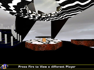
Meeting space.
The meeting space join the two parts together by a catwalk for Prada, leading to the center, and a stage balcony leading Madonna down to the meeting space platform.
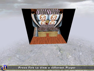
Madonnas office.
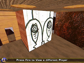
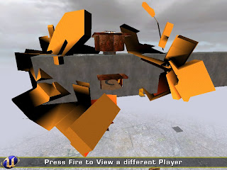
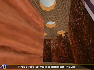
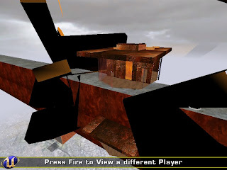
The shape is made from the sarcasm of keeping one's limits "inside the box", which Madonna clearly haven't done throughout her career. The texturing and interior design was a combination of wilderness and glamourous lightening.
In the building there is the main office situated at the top floor and a studio for dancing at the bottom of the building. There is a lot of different spaces in the building to meet clients, assuming Madonna meets lots of them, I created various meetingplaces for a bit of variation for her.
Prenumerera på:
Inlägg (Atom)